

Text Input
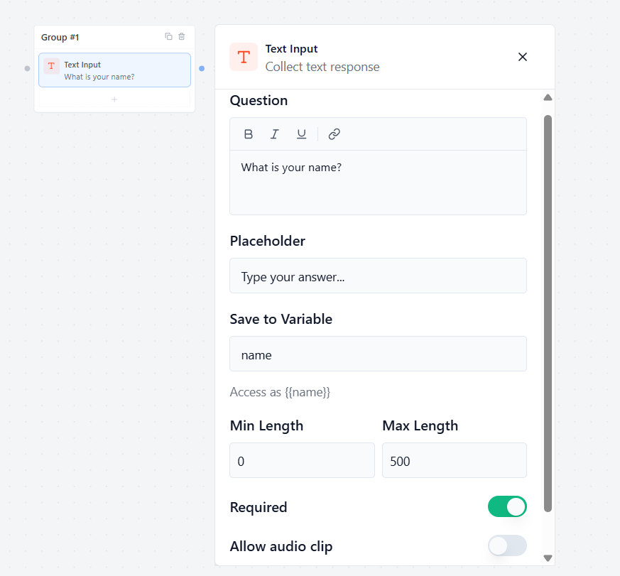
The Text Input block allows you to collect a short, single-line text response from your user.
Question
Type the message or question you want the bot to ask the user.
- Example: “May I know your name?”
Placeholder
Type a hint text that appears inside the empty input box before the user starts typing.
- Example: “Type your full name here…”
Save to Variable
Select or create a custom storage variable to save the user’s response.
- How to use it later: You can easily display this answer in any later chat bubble by typing the variable name inside double curly brackets, like {{name}}.
Min Length & Max Length
Set character limits for the answer:
- Min Length: The fewest letters the user must type to move forward.
- Max Length: The maximum number of letters allowed in the box.
Allow Audio Clip
Toggle this switch to let users upload or attach a pre-recorded audio file (like an MP3 or OGG voice clip) as their answer.
Allow Attachment
Toggle this switch to let users attach and upload standard files or documents (like PDFs or images) alongside their response.
Text Area
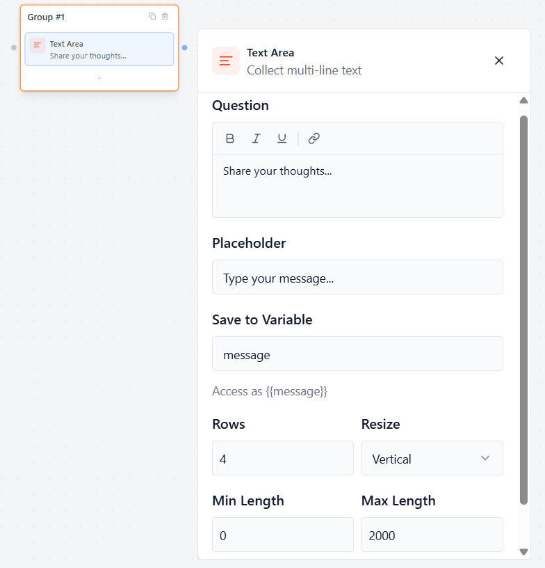
The Text Area block allows you to collect a longer, multi-line text response from your user.
Question
Type the question or prompt you want the bot to show the user.
- Example: “Share your thoughts…”
Placeholder
Type a hint text that appears inside the empty box before the user begins writing.
- Example: “Write your feedback here…”
Save to Variable
Select or create a custom variable to save the user’s long response.
- How to use it later: You can easily display this message in any later chat bubble by typing {{message}}.
Rows
Type a number to set the starting height of the text box. A higher number makes the box taller right from the start so users see more lines of text.
Resize
Click this dropdown to control how users can manually change the size of the text box on their screen:
- Vertical: Users can only drag the box up and down to make it taller or shorter.
- Both: Users can freely drag the box both up/down and left/right to change its shape.
Min and Max Length
Set character limits for the response. This controls the minimum and maximum number of letters or symbols a user is allowed to type.
Required
Toggle this switch to choose if the question is mandatory.
- Enabled (Green): The user must write something in the text box before they can move forward.
Email Field
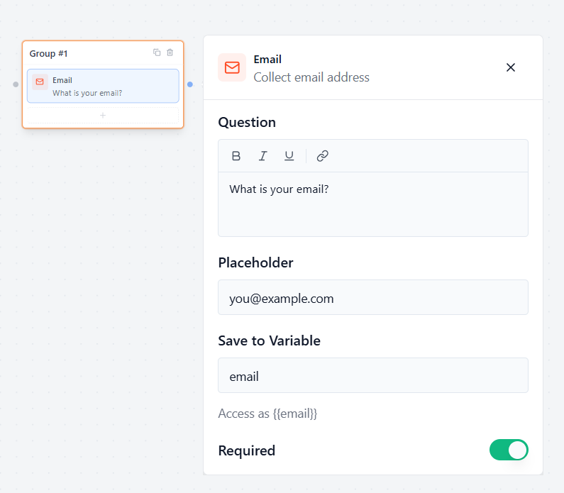
The Email Field block allows you to safely collect email addresses from your users.
Question
Type the message or question you want the bot to show the user.
- Example: “What is your email address?”
Placeholder
Type a hint text that appears inside the empty input box before the user types.
- Example: “name@example.com”
Save to Variable
Select or create a custom variable to save the user’s email address.
- How to use it later: You can display this email in any later chat bubble by typing {{email}}.
Validation & Rules
Smart Email Check (Automatic)
Formgic automatically checks the input text. If a user forgets the @ symbol or a proper extension (like .com), the form will stop them and gently ask for a valid email address before they can move forward.
Required
Toggle this switch to control if the email is mandatory.
- Enabled (Green): The user must type a valid email address to continue the conversation.
Number
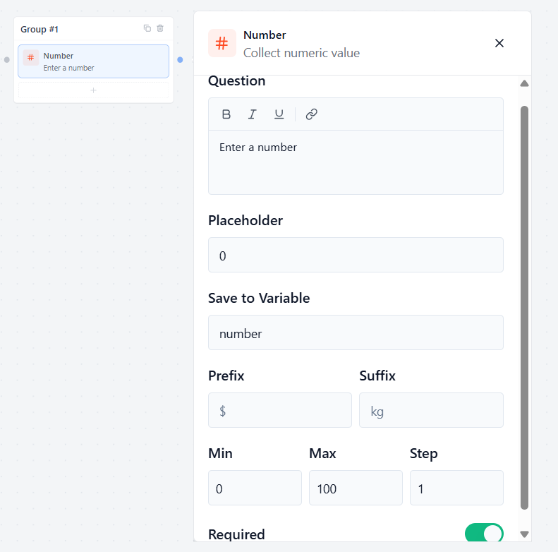
The Number block allows you to collect a purely numeric value from your user.
Question
Type the question or prompt you want the bot to show the user.
- Example: “How old are you?”
Placeholder
Type a hint number that appears inside the empty box before the user types.
- Example: “0”
Save to Variable
Select or create a custom variable to save the user’s numeric response.
- How to use it later: You can display this number in any later chat bubble by typing your variable name, like {{age}}.
Prefix
Type a symbol or word that appears before the input box.
- Example: Adding $ or ₹ for currency values.
Suffix
Type a symbol or word that appears after the input box.
- Example: Adding % for percentages, or kg for weight measurements.
Validation Rules
Min & Max
Set strict limits for the numeric value:
- Min: The lowest number the user is allowed to enter.
- Max: The highest number the user is allowed to enter.
Step
Set the increment size for the input. For example, setting this to 5 will allow numbers like 5, 10, 15, etc. Setting it to 1 allows standard counting numbers.
Required
Toggle this switch to control if the question is mandatory.
- Enable: The user must enter a number before they can move forward.
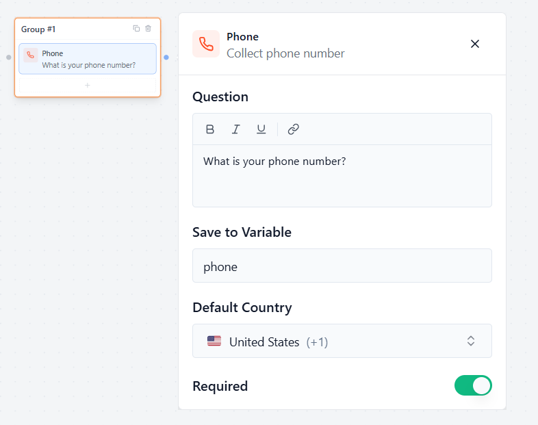
Phone Input
The Phone block allows you to collect telephone numbers accurately from users all over the world.
Question
Type the message or question you want the bot to show the user.
- Example: “What is your phone number?”
Save to Variable
Select or create a custom variable to save the phone number response safely.
- How to use it later: You can display the collected phone number later by typing your variable name, like {{phone}}.
Country & Rules
Default Country
Click this dropdown menu to choose which country flag and country code should show up inside the input box by default when the chat first loads.
- Example: Selecting “United States (+1)” or “India (+91)” ensures the most common code for your target audience is ready to go automatically.
Required
Toggle this switch to control if entering a phone number is mandatory.
- Enable: The user must enter a valid phone number before they are allowed to move forward in the conversation.
Date Picker
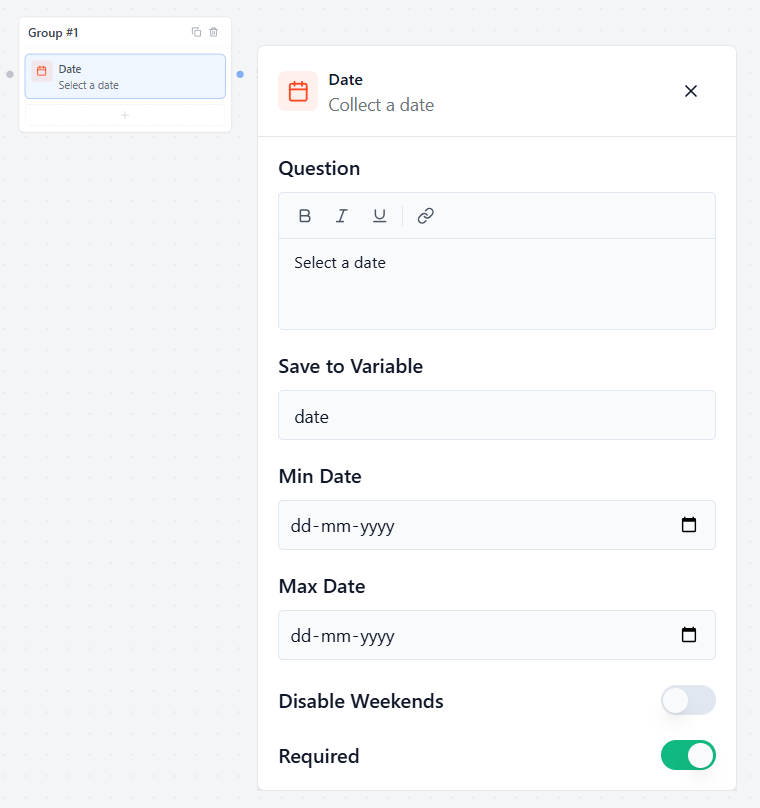
The Date block allows you to display a clean, interactive popup calendar inside the chat window. This makes it incredibly easy for users to pick a date without making any typing mistakes.
Basic Settings
Question
Type the message or question you want the bot to display above the calendar.
- Example: “Select a date” or “When is your birthday?”
Save to Variable
Select or create a custom variable to save the date selected by the user.
- How to use it later: You can display the chosen date in any later chat bubble by typing your variable name, like {{date}}.
Calendar Limits & Rules
Min Date & Max Date
Set limits on which days users are allowed to click inside the calendar:
- Min Date: The earliest date a user can select. Any dates before this day will be locked and unclickable.
- Max Date: The furthest future date a user can select. Any dates after this day will be locked.
Disable Weekends
Toggle this switch to automatically block out Saturdays and Sundays on the calendar.
- Best used for: B2B companies, office appointments, or booking professional consultations that only take place during regular weekdays (Monday to Friday).
Required
Toggle this switch to control if picking a date is mandatory.
- Enabled (Green): The user must select a valid date from the calendar before they can move forward.
Time Picker
The Time block allows users to quickly select a time from an interactive clock menu without typing manually.
Question
Enter the message you want to show above the time picker.
- Example: “Select a time” or “When is the best time to call you?”
Save to Variable
Select or create a custom variable to save the exact time selected by the user.
- How to use it later: You can display the chosen time in any later chat bubble by typing your variable name, like {{time}}.
Format & Rules
Time Format
Choose how the time should be displayed.
- 12 Hours (AM/PM): Example: 2:30 PM
- 24 Hour: Example: 14:30
Required
Toggle this switch to control if picking a time slot is mandatory.
- Enabled : The user must choose a valid time slot from the menu before they can move forward.
Website
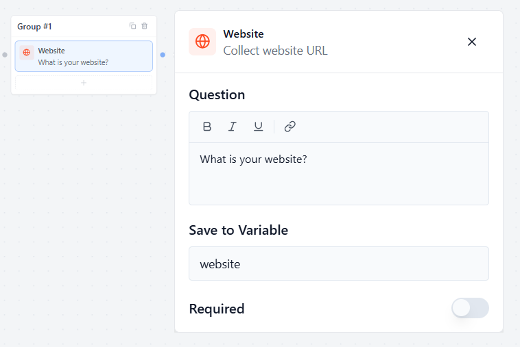
The Website block allows you to collect a web address (URL) from your users safely and accurately.
Question
Type the message or question you want the bot to show the user.
- Example: “What is your website?” or “Paste your portfolio link below:”
Save to Variable
Select or create a custom variable to save the website address.
- How to use it later: You can display this link in any later chat bubble by typing your variable name, like {{website}}.
Smart Link Check (Automatic)
Formgic automatically checks the text entered by the user. If they forget to include a proper web structure (like a domain extension such as .com, .org, or .net), the form will stop them and gently ask for a valid website URL before letting them move forward.
Required
Toggle this switch to control if entering a website link is mandatory.
- Enabled (Green): The user must type a valid website address to continue the conversation.
Rating
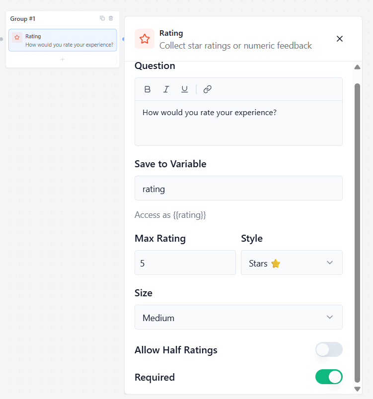
The Rating block allows you to collect visual feedback, stars, or numerical scores from your users. It is an excellent way to run customer satisfaction surveys (CSAT) or review checks right inside the chat window.
Basic Settings
Question
Type the question or message you want the bot to display above the rating icons.
- Example: “How would you rate your experience today?”
Save to Variable
Select or create a custom variable to save the numerical score chosen by the user.
- How to use it later: You can display the selected rating number in any later chat bubble by typing your variable name, like {{rating}}.
Customization Settings
Max Rating
Set the highest score limit for your rating scale.
- Example: Type 5 for a standard 5-star review, or 10 for a wider 10-point scale.
Style
Click this dropdown menu to choose how your rating choices look to the user:
- Stars ⭐: Displays classic clickable star icons.
- Number: Displays a clean row of sequential number buttons (e.g., 1, 2, 3, 4, 5).
- Emoji: Displays expressive faces or symbols for a fun, casual feeling.
Size
Click this dropdown menu to change the visual size of the rating icons on the screen (e.g., Small, Medium, Large) so they match your chat interface beautifully.
Rules & Configuration
Allow Half Ratings
Toggle this switch to let users select fractional scores.
- Enable: Users can click the exact half-point of a star or emoji to give a score like 4.5 out of 5.
- Disabled: Users can only click whole numbers, giving solid scores like 4 or 5.
Required
Toggle this switch to control if giving a rating score is mandatory.
- Enable: The user must select a rating value before they are allowed to move forward.
File Upload
The File Upload block allows your users to safely attach and upload files, documents, or images directly inside the chat window.
Basic Settings
Bot Message
Type the message or instruction you want the bot to display right above the upload box.
- Example: “Upload a file” or “Please share your resume below:”
Save to Variable
Select or create a custom variable to store the secure link of the uploaded file.
- How to use it later: You can access or display the file link in any later chat bubble by typing your variable name, like {{file}}.
Upload Rules & Limits
Accepted File Types
Specify exactly what kinds of files users are allowed to upload. Type them out as standard extensions separated by commas.
- Example: .pdf, .jpg, .png, .docx
- Tip: Leave this empty if you want to allow any file type.
Max File Size (MB)
Type a number to set the maximum file size weight allowed for a single upload.
- Example: Entering 5 means any file larger than 5MB will be blocked automatically to save your server space.
Allow Multiple Files
Toggle this switch if you want to let users select and upload more than one file at the same time.
- Disabled: Users can only upload 1 file.
Required
Toggle this switch to control if the upload step is mandatory.
- Enabled (Green): The user must successfully upload a file before they can continue.