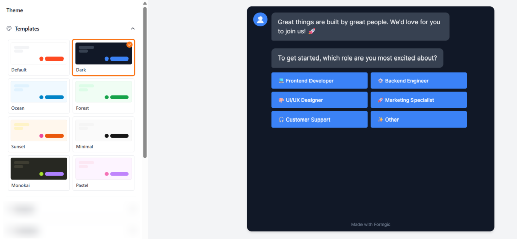
Theme Templates #
Themes control the overall look and style of your conversational form. Instead of styling everything manually, you can apply a complete design instantly with one click.
By default, Formgic includes several built-in theme templates such as Default, Dark, Ocean, Forest, and more.
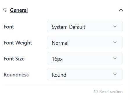
General Settings #
The General settings control the main font style, text appearance, and overall shape of your conversational form. These settings are applied across chat bubbles, buttons, and input fields automatically.
Font: Select the global typeface for your entire conversation from the dropdown menu (e.g., System Default, Inter, or custom web fonts). This updates all text elements simultaneously to maintain design consistency.
Font Weight: It controls how thick or bold the text appears. Choose from standard weight profiles depending on your brand’s style:
- Light (300)
- Normal (400)
- Medium (500)
- Semi Bold (600)
- Bold (700)
Font Size: Set the size of the chatbot text. Larger font sizes improve readability, especially on mobile devices. Example: 14px, 16px, 18px
Roundness: Define the global corner radius styling for all message bubbles, input fields, and interactive selection buttons. This sets the primary geometric tone of your interface:
- Sharp (0px) – Crisp, boxy, highly formal corporate look.
- Small (4px) – Subtly soft edges for a modern tech feel.
- Medium (8px) – Balanced, professional, and clean Flat 2.0 aesthetic.
- Round (16px) – Friendly, approachable, highly interactive messaging vibe.
- Extra Large (24px+) – Ultra-pill styling, perfect for trendy consumer or SaaS landing pages.
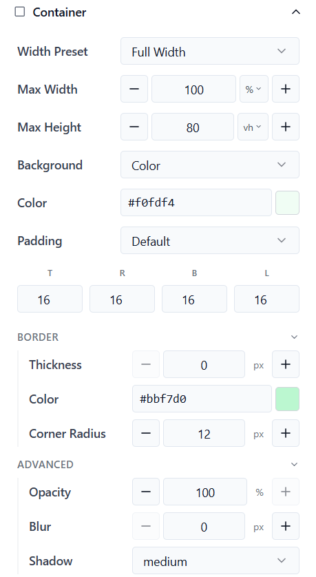
Container #
The Container settings control the main chatbot layout, size, spacing, and background appearance. These settings affect the overall chat window shown to users.
Width Preset Choose the container width style. This controls how wide the chatbot appears on the page. Common options: Full Width/ Boxed/ Custom Width
Max Width: Set the maximum width of the chatbot container. Larger widths create a wider conversation area. Example: 100%, 800px
Max Height : Set the maximum height of the chatbot window. If the content becomes larger than the selected height, scrolling will appear automatically. Example: 80vh, 600px
Background: Choose the background style for the chatbot container. Different background styles help match your chatbot design with your website branding and visual style.
- Color → Use a solid background color
- Transparent → Makes the container background transparent
- Mirror → Creates a glass or frosted-style transparent effect
- Image → Use a custom background image
Padding: Controls the spacing inside the chatbot container. Higher padding creates more space around the conversation
Border Settings #
Thickness: Set the border size around the container.
Border Color: Choose the border color
Corner Radius: Controls how rounded the container corners appear. Higher values create a softer and more modern appearance.
Advanced Settings
Opacity: Controls the transparency of the container.
Blur: Adds a blur effect to the container background. Higher values create a glass-style appearance.
Shadow: Controls the shadow effect around the chatbot container. Shadows help the chatbot stand out from the page background.
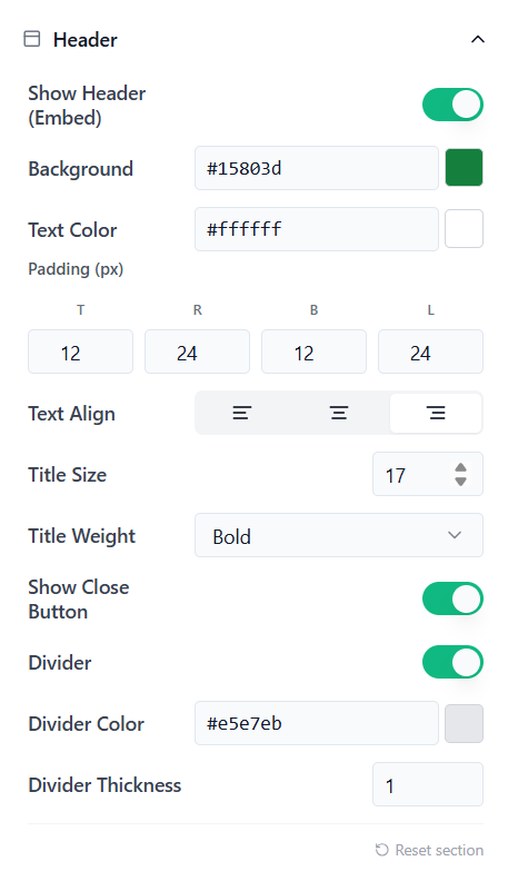
Header: #
The Header settings control the top bar shown on the embedded chat widget. You can customize the header color, text style, spacing, close button, and divider.
Show Header (Embed): Enable this option to display a header at the top of the embedded chat widget.
Background: Choose the background color for the header.
Text Color: Choose the color of the header text.
Padding (px): Controls the spacing inside the header. Example:
- Top: 12
- Right: 24
- Bottom: 12
- Left: 24
Text Align: Choose how the header text should be aligned.
Title Size: Set the size of the header title text.
Title Weight: Choose how bold the header title should appear.
Show Close Button: Enable this option to display a close button in the header. This allows users to close the chat widget.
Divider: Enable this option to show a divider line below the header.
Divider Color: Choose the color of the divider line.
Divider Thickness: Set the thickness of the divider line.
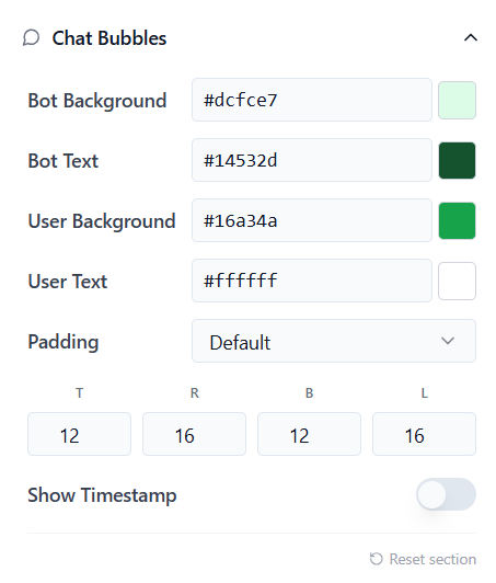
Chat Bubbles: #
The Chat Bubble settings control the appearance of both bot messages and user responses inside the conversation.
Bot Background : Choose the background color for bot messages.
Bot Text: Choose the text color used inside bot messages.
User Background: Choose the background color for user response bubbles.
User Text: Choose the text color used inside user response bubbles.
Padding: Controls the inner spacing inside chat bubbles.
Show Timestamp: Enable this option to display message timestamps inside the conversation. Timestamps help users see when messages were sent during the chat flow
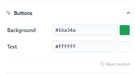
Buttons #
The Button settings control the appearance of clickable buttons inside your conversational form. These settings help you match button styles with your chatbot theme and branding.
Background: Choose the background color for buttons.
Text: Choose the text color displayed inside buttons. Using high contrast between the button background and text improves readability and user interaction.
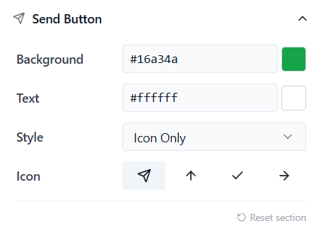
Send Button: #
The Send Button settings control the appearance and style of the message submit button inside the chatbot input area.
Background: Choose the background color for the send button
Text : Choose the icon or text color displayed inside the send button
Style: Choose how the send button should appear.
Icon: Select the icon used for the send button. The selected icon appears inside the send button when users submit messages.
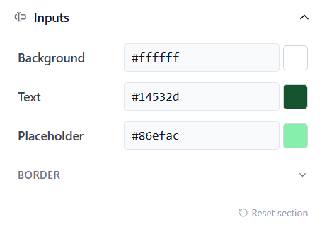
Inputs #
The Input settings control the appearance of text fields and input areas inside your conversational form.
Background: Choose the background color for input fields.
Text: Choose the text color used inside input fields.
Placeholder: Choose the color used for placeholder text inside input fields.
Border Settings: The Border settings control the outline appearance of input fields.
Avatars #
The Avatar settings control the appearance and behavior of profile icons shown inside the conversation.
Bot Avatar: Enable this option to display the bot avatar inside the conversation
Image: Choose how to add the avatar image.
Common options:
- Upload
- Icon
- URL
Shape: Choose the avatar shape. Different shapes help match your chatbot design style.
Display: Controls how often the avatar appears during the conversation.
Grouped: Shows the avatar once for consecutive messages inside the same group. This creates a cleaner and more modern chat appearance.
Every Bubble: Displays the avatar next to every message bubble. Useful for more traditional messaging layouts.
Background: Choose the background color used behind the avatar.
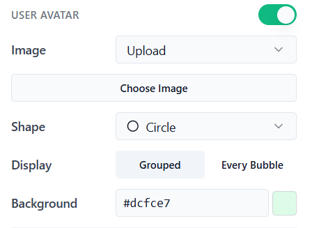
User Avatar: The User Avatar settings control how the user’s profile icon appears inside the conversation. Enable this option to display a user avatar next to user response messages.
Image: Choose how to add the user avatar image.
Shape: Choose the avatar shape.
Display
Controls how often the user avatar appears during the conversation.
Grouped
Shows the avatar once for consecutive user messages inside the same group. This creates a cleaner and more modern chat layout.
Every Bubble: Displays the avatar next to every user message bubble. Useful for traditional messaging-style layouts.
Background: Choose the background color used behind the user avatar
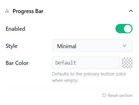
Progress Bar: The Progress Bar shows users how much of the conversation or form has been completed. Enable this option to display a progress bar at the top of the chatbot.
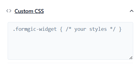
Custom CSS
The Custom CSS section allows you to add your own CSS code to fully customize the appearance of your conversational form.


