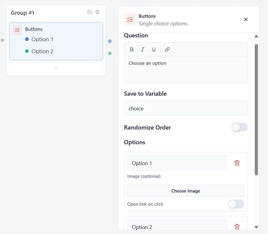
Buttons Block #
The Buttons block allows you to display quick, clickable options directly inside the chat window. Users can tap their answer instantly instead of typing.
Question #
Type the message or question that will appear right above your choices.
- Example: “Choose the preferred method”
Save to Variable #
Select or create a custom variable to save the specific button choice the user clicks on.
- How to use it later: You can display the selected answer in any later chat bubble by typing your variable name, like {{choice}}.
Randomize Order #
Toggle this switch to mix up the order of the buttons for every new user. This is great for keeping quizzes or surveys neutral and unbiased.
Managing Options #
Options List #
Type your custom text into the fields to name each choice (e.g., “Option 1”, “Option 2”).
Add Option: Click this button to create a new choice button in the list.
Smart Routing: On the canvas canvas grid, each option will generate its own connector handle so you can easily wire different buttons to completely different groups!
Image (Optional) #
Click Choose Image next to any option to add a picture directly onto that button from your WordPress Media Library. This instantly converts your standard text buttons into a beautiful, visual choice grid.
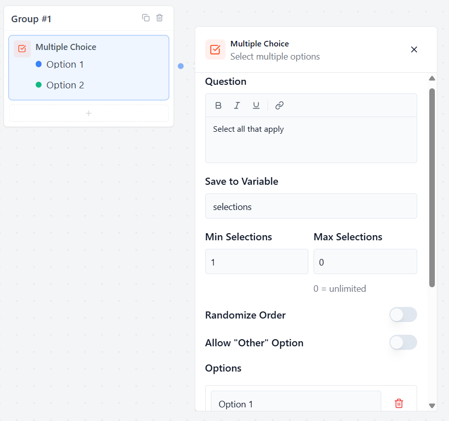
Multiple Choice #
The Multiple Choice block allows you to display a list of options with checkboxes, letting users select one or more answers at the same time.
Question #
Type the message or instruction that will appear above the checkboxes.
- Example: “Select all that apply”
Save to Variable #
Select or create a custom variable to save the answers chosen by the user. If they pick multiple choices, they will all be saved inside this single variable.
Randomize Order #
Toggle this switch to mix up the visual order of the choices for your live users.
- Note: The choices stay in a fixed order inside your backend builder canvas so you can edit easily. Shuffling only happens in the live preview or on your live website.
Allow “Other” Option #
Toggle this switch to automatically add an “Other” checkbox at the bottom of the list. When a user ticks it, a small text box opens up so they can type in a custom answer that isn’t on your list.
Selection Limits #
Min Selections #
Type the minimum number of choices a user must select before they are allowed to submit the form.
Max Selections #
Type the maximum number of choices a user is allowed to tick.
- Tip: Set this to 0 if you want it to be unlimited, allowing users to select as many boxes as they want.
Managing Options #
Options List #
Type your custom text into the fields to create your checkboxes. Click Add Option to add more choices to your list.
Image (Optional) #
Click Choose Image next to any option to add a picture or icon alongside the checkbox. This turns a basic text list into a beautiful, visual choice grid.
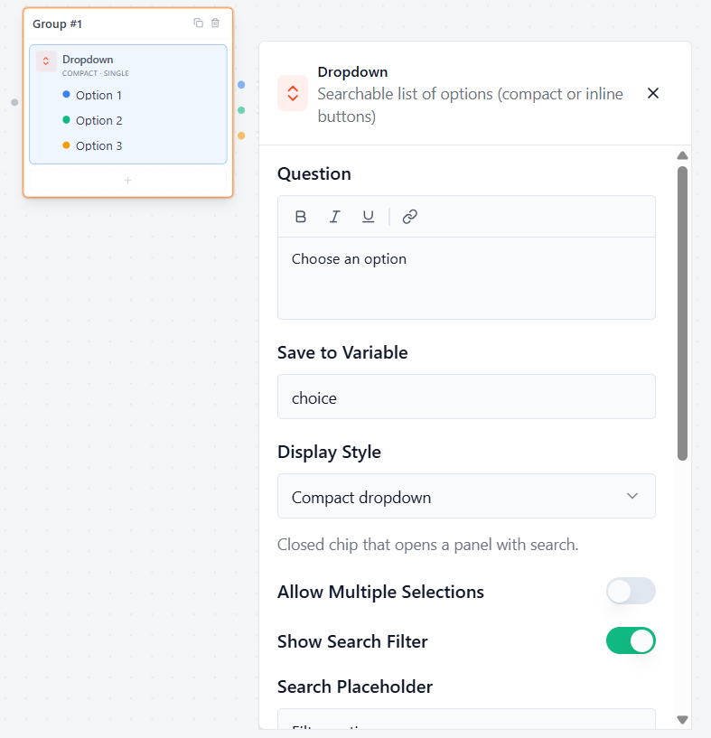
Dropdown Block #
The Dropdown block lets users select one or more options from a searchable list. It is ideal when you have many choices and want to keep your form clean and compact.
Question #
In the question box, enter the question or prompt you want to display above the dropdown.
Example:
“Choose an option”
Save to Variable: Create a variable where the user’s selection will be stored.
Example: choice
You can use this variable later in your flow with: {{choice}}
Display Style
Choose how the dropdown appears to users.
Inline Options:
This option display style shows choices directly inside the chat as clickable buttons. Users can see all available options immediately without opening a dropdown menu.
Example:
🟦 Option 1 🟦 Option 2 🟦 Option 3
Compact Dropdown
The Compact Dropdown display style shows a single dropdown field in the chat. When users click it, a panel opens displaying all available options and an optional search box.
Allow Multiple Selections
Enable this option if users should be able to select more than one choice.
Enabled: Users can select multiple options.
Disabled: Users can select only one option.
Show Search Filter
Displays a search box inside the dropdown to help users quickly find options. Useful when you have a long list of choices.
Search Placeholder
Enter the text displayed inside the search box before the user starts typing.
Example:
Filter options…
Randomize Order
Enable this option to display the choices in a random order each time the form is opened.
Useful for surveys, quizzes, and unbiased feedback forms.
Allow “Other” Option
Adds an Other choice that allows users to enter a custom answer not included in the predefined options.
Options
Add the choices users can select from. Click Add Option to create additional choices.


