Understanding the Builder Interface #
Now let’s take a look at the Builder Interface. When you open a form for editing, you will see the Flow Builder screen. It is divided into three main sections: the Left Sidebar for adding elements, the Main Canvas for building the form, and the Top Header Bar for saving, previewing, and testing your form.
Flow Builder Interface Overview
- Understanding the Flow Builder Canvas
The Canvas is the large, dotted workspace in the center of your screen. Think of it like a giant digital whiteboard where you build your forms.
- The Start Node: Every new form has a small orange flag labeled Start at the top. This is the exact spot where your customer’s conversation begins.
- The Blocks Sidebar: On the left side, you have a menu full of different options. You can easily drag any item from this menu and drop it directly onto the canvas grid.
- Groups: When you drag an item from the left sidebar onto the canvas, it automatically creates a new Group. These are the large white boxes on the grid like Group #1 or Group #2. They act as containers to hold your text messages and questions together.
A simple flow with a Start Node and Group #1 - Bubbles: Use these blocks to show basic content like Text, Images, or Videos to the user. Bubbles do not collect any information from the visitor; they only display information or messages on the screen.
- Inputs: Use these blocks when you need the user to give you information. This includes things like typing an Email, picking a Date, or clicking choice Buttons.
Bubble vs Input Blocks
- Canvas Navigation & Zoom Controls
Because your forms can grow quite large, the canvas gives you total freedom to move around and adjust your view. Look at the floating menu in the top right corner of the grid to control your view:
- Moving Around (Panning): Just click anywhere on the empty gray grid background, hold your mouse down, and drag. This slides the canvas around so you can find your blocks easily.
Tip: Click and drag anywhere on the empty canvas to move around your workflow - Zooming In and Out: Click the plus (+) button in the floating menu to zoom in and read text closely. Click the minus (-) button to zoom out and see your entire form layout.
- Fit to View: Click the button with the two diagonal arrows (⤢). This will instantly center your screen and automatically fit your entire form perfectly onto your monitor so you never get lost.
- The Mini Map: Look at the bottom right corner of your screen. This small window shows you a tiny map of your whole canvas. It helps you see where you are if you have built a massive workflow.
Canvas controls for navigating and adjusting your workspace
- Horizontal vs Vertical Layouts
Formgic lets you choose how you want to organize your blocks on the screen while you work. In the floating menu at the top right of the grid, look for the two layout arrows:
- Horizontal Layout (Right Arrow →): Click this to arrange your form blocks side-by-side. The conversation paths will move cleanly from left to right.
- Vertical Layout (Down Arrow ↓): Click this to arrange your form blocks on top of each other. The conversation paths will flow downwards from top to bottom.
Note: This layout tool is just to help you keep your workspace neat and organized. Changing it does not change how the form looks to your website visitors.
- Previewing Flows
You can test your form at any time while you are building it to make sure everything works perfectly.
- Look at the top right header bar and click the 👁️ Preview button.
- This opens a live window where you can interact with your form just like a regular website visitor would.
- You can type test answers, click buttons, check the styling, and see if your connecting lines route users to the right questions before you click the orange Save & Publish button.
Live preview of your conversational form
Groups & Flow Structure #
- What Are Groups?
A Group is a visual container on your canvas that holds blocks (like texts, questions, or images) together. Think of it as a single chapter or step in your conversation—like a “Welcome Screen” or “Contact Info” section.
Organizing loose blocks into groups keeps your canvas clean, easy to read, and simple to move around without breaking your setup.
Group containing multiple blocks
How They Run #
When a user reaches a group, Formgic runs the blocks from top to bottom:
- Shows Content: It displays your text messages or images one after the other.
- Pauses for Answers: When it hits a question, it pauses and waits for the user to type or click an answer.
- Moves Forward: Once answered, it unpauses and moves instantly to the next block down.
Creating Groups #
There are two simple ways to create groups inside the Formgic canvas builder.
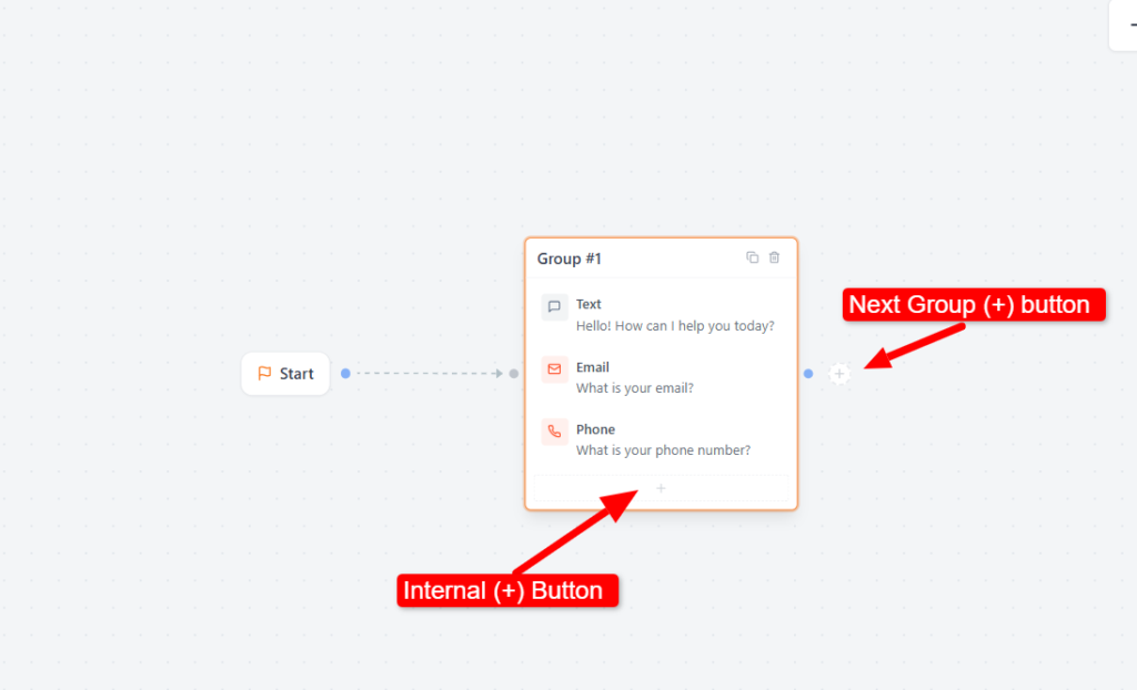
Method 1: Using the Main Plus (+) Button #
Click the main + button on the canvas and select the field or block you want to add. Formgic will automatically create a new group and place your selected block inside it.
Create a new group using the canvas add button
- To add more blocks inside the same group: Use the internal + button at the bottom of the group container.
- To create the next group in the flow: Click the Next Group (+) button button on the edge of the group. This will instantly create a new group, automatically wire them together, and keep the conversation moving forward.
Add blocks within a group or create a new group
Method 2: Drag & Drop Blocks Manually #
You can also create groups manually by dragging blocks from the right-side panel into the canvas builder.
- Drag any field block from the right-side panel and drop it directly onto the empty canvas to form a new group.
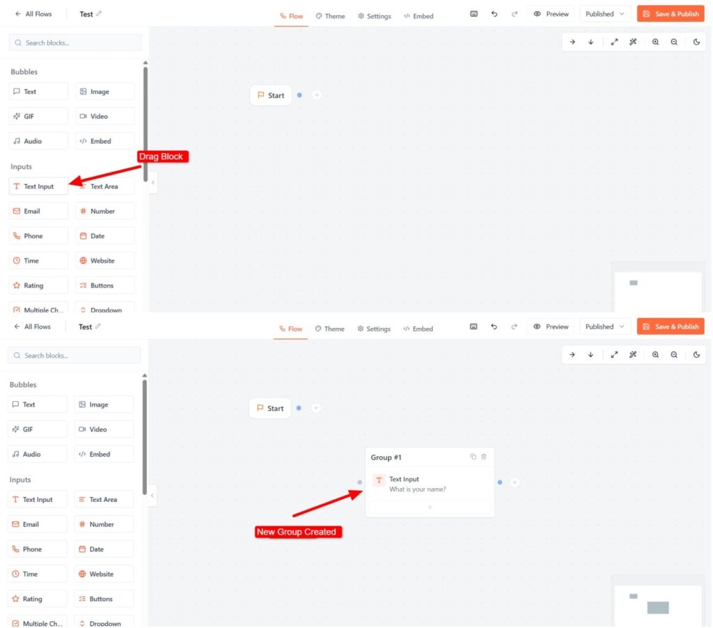
Drag a block from the sidebar and drop it onto the canvas to create a new group
- Stack multiple blocks inside that container to group them together.
- Click and drag the node wires to manually connect your groups and map out your custom conversational paths.
- Organizing Conversational Paths
Once your groups are created, connect them to control the flow of the conversation.
Connecting Groups #
To control how your conversation moves, you need to connect your groups together using the visual handles on the canvas.
1. Linking the Start Node
The blue dot on the Start Node represents the starting point of your chatbot flow.
- To begin: Click and drag the wire from the Start handle and drop it onto your very first group.
- The Rule: The conversation will always begin wherever this Start Node is pointed. If a group is not linked to this main path, users will never see it.
2. Connecting Groups with Visual Handles
Every group and button block includes a colored connector point on its edge.
- To begin: Click and drag the wire from the Start handle and drop it onto your very first group
- To connect groups: Click and drag a wire from the connector point of one group and drop it onto another group.
Connect groups using connector handles and connection paths
- To delete a connection: Click the connection wire, then press Delete or click the small × icon.
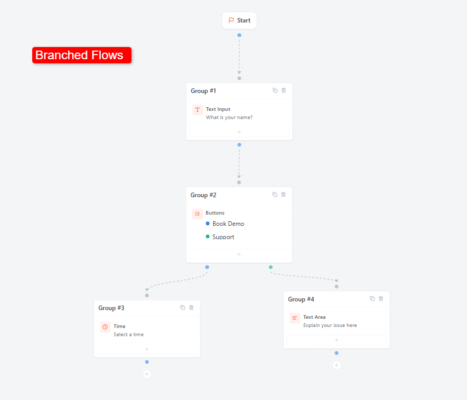
Linear vs. Branched Flows #
Linear Flows #
Linear flows move users step-by-step from one group to the next in a straight line.
- Example: Name → Email → Phone Number
- Useful for: Lead forms, contact forms, and simple conversational flows.
Branched Flows #
Branched flows send users to entirely different conversation paths based on the option they choose.
- Example: Clicking “Book Demo” opens a calendar booking section, while clicking “Support” takes them to a help section.


